Here are all the photos done for this topic with quick description of the photos on each sheet.
Nothing particularly good on this sheet, most of the shots here were to flat/confined, not giving much sense of the movement of the space.
By moving closer toward the corridor in the first,third etc shots and contrasting it with the wooden door some of the flatness is removed and the feeling of moving from lecture to lecture is introduced. Even with these improvements the pillar and shape of this area do not give much room to express what I wanted.
The second, fourth etc shots give a nice sense of depth to the shot, the thick gray flooring draws the eye toward the door, subtly hinting at the exit sign.
Similarly to the previous sheet, 39-41 have strong horizontal lines that draw the viewer through the photo, first toward the left passage to around to the right where the green exit sign is.
The second 42 and 47 are two shots that are options for my final 5. 42 has strong lines through the railing, stairs, walls and pillars, once again the gray flooring provides a central direction for the eye to travel to rest of the exit. 47 is nice and simple, straight lines frame the exit sign, I am likely to use this shot as the transition (3rd) piece to split the first two shots which will be wide open and bright with smaller exit signs from the last 2 shots which will be darker and feature the exit sign more predominantly.
The second 52 is the only real interesting shot here and will be the final shot for my series.
This sheet is a revisit to an earlier photo, trying out different perspectives.
I was not impressed with this area, the full length windows limited my options, otherwise I would have had myself in a number of shots...
More attempts at getting different perspectives on previous shots, this time around most of the lights were off so the reflections were cool, but the perspective looking down the stairs feels the best.
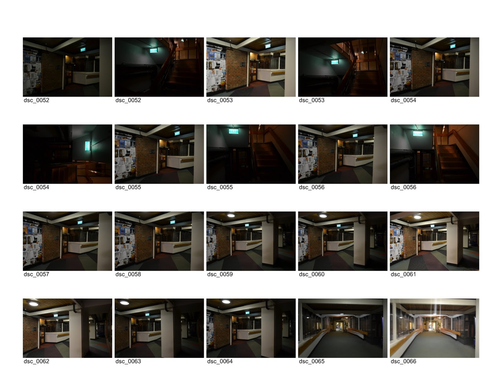
Retakes of downstairs perspective with different lighting, some attempts at getting up close and personal with an exit sign O.o
Ditto to last sheet.
The close up reflection shots could work as a second to last shot
Just a couple shots, even when taking them did not expect them to work out well.
That concludes the over view... Next post will contain the candidates for this project, finishing up with the final selection.